By: Glaelis Sierra – Account Director at Williams Whittle
A logo is the symbol or design that represents your organization, but it really encompasses much more than that. A logo should capture your mission, vision and company values. At the same time, you want it to make a visual statement as part of your brand identity.
So, what is brand identity?
Brand identity is the collection of all elements that an organization creates to depict the right image to its target audiences. This includes a logo, among other things.
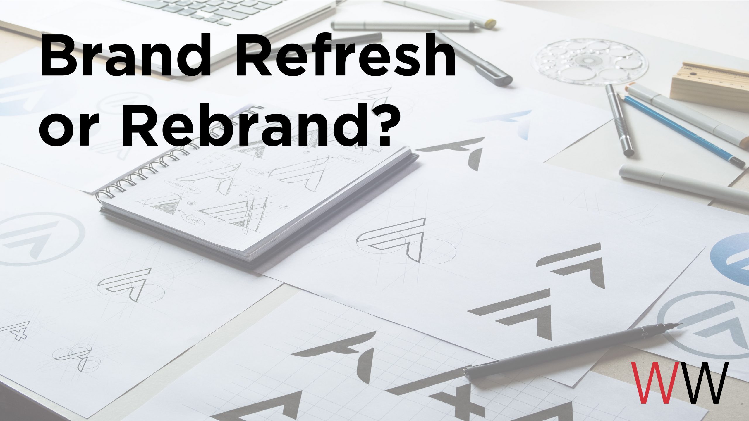
A brand refresh is a makeover. The colors and fonts may be modernized. The logo may be simplified. The tagline may be updated.
A rebrand is a repositioning of your organization. Based on customer insights from research and data, a rebranding helps an organization reach a new market, expand their business scope or change the business model, or launch a new service. It may include a new name, repositioning, messaging, or a new visual system.
So how do you know when it’s time for a change? And should you consider a brand refresh or a rebrand?
Here are a few reasons why you might want to consider a refresh of your logo:
1. The logo is too old – maybe you’ve had the same logo since you created your company. Whether it was 10 years ago or 50, it’s easy to spot an outdated logo. Fonts and design elements change over time.
2. The logo is too complex – logos created before the digital era might suffer from a case of “lost in translation”. It might look great on letterhead, but not so good on your social media’s profile pic. Modern designs are all about simplicity. If a logo is too complex or busy, it might not read well on social media or any digital design. That’s a sign that your logo needs to be updated.
Old logo
New logo
Our client Wesley Housing hired WW to refresh their logo. The agency added the tagline. “Building Up” to reflect their mission.
3. The logo is too evident – logos should represent your organization in every way, but sometimes it’s too obvious to your mission.
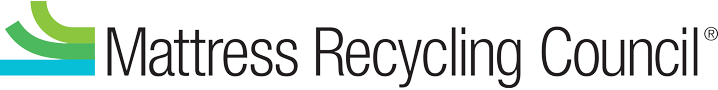
For example, a few years ago Williams Whittle was tasked to redesign our client’s logo for the Mattress Recycling Council (MRC). The original logo was very obvious to the mission of MRC and left no room for growth. For the refresh, the agency recommended a more stylized and less evident approach. The new logo is modern and clean. Using brighter blues and greens to show sustainability, the icon represents the components a mattress can be recycled into. The design of the icon is much more stylized, than its predecessor and allows for a less literal description of the organization. The name — in a black, classically modern font — gives equal weight to “recycling council” as it does to “mattress”. The new logo is much easier to print on various backgrounds, is more readable, recognizable, and flexible as the MRC brand awareness grows.

Old logo
New logo
And when is it time to consider a rebrand?
A good indicator to consider a rebrand is when the company is evolving. Think about when the logo was originally created, it probably resembled everything that your organization stood for back then. Although some values might still be the same, we know that companies evolve over time. New services, products and visions can all be signs of needing a logo redesign that represents those new ideas. It can also represent a new direction or a new sub-brand within your organization.
An organization that our agency partnered with to rebrand was the National Park Trust (NPT). Like many brands, theirs had been evolving from their roots as a preservation-only nonprofit to one that was connecting kids to parks to create future stewards of land preservation. Their logo and tagline needed to reflect the duality of their mission.
The original logo was designed in the 1980s. At the time NPT was solely focused on land preservation – the acquisition and protection of parks, wildlife refuges, historic landmarks, public lands and waterways.
In the 1990s, the logo was re-worked, playing down the word National to make all parks inclusive, from national to state to local. The silhouette of a child was added to emphasize NPT’s focus on children’s programming.
In 2013, the agency developed their new logo which includes a simplified and modern-looking tree, a water horizon in line with the rivers, lakes and oceans in parks that NPT works to protect. The tagline “Treasure Forever” was developed to inspire parents to take their kids to the parks and treasure the memories created in them forever.
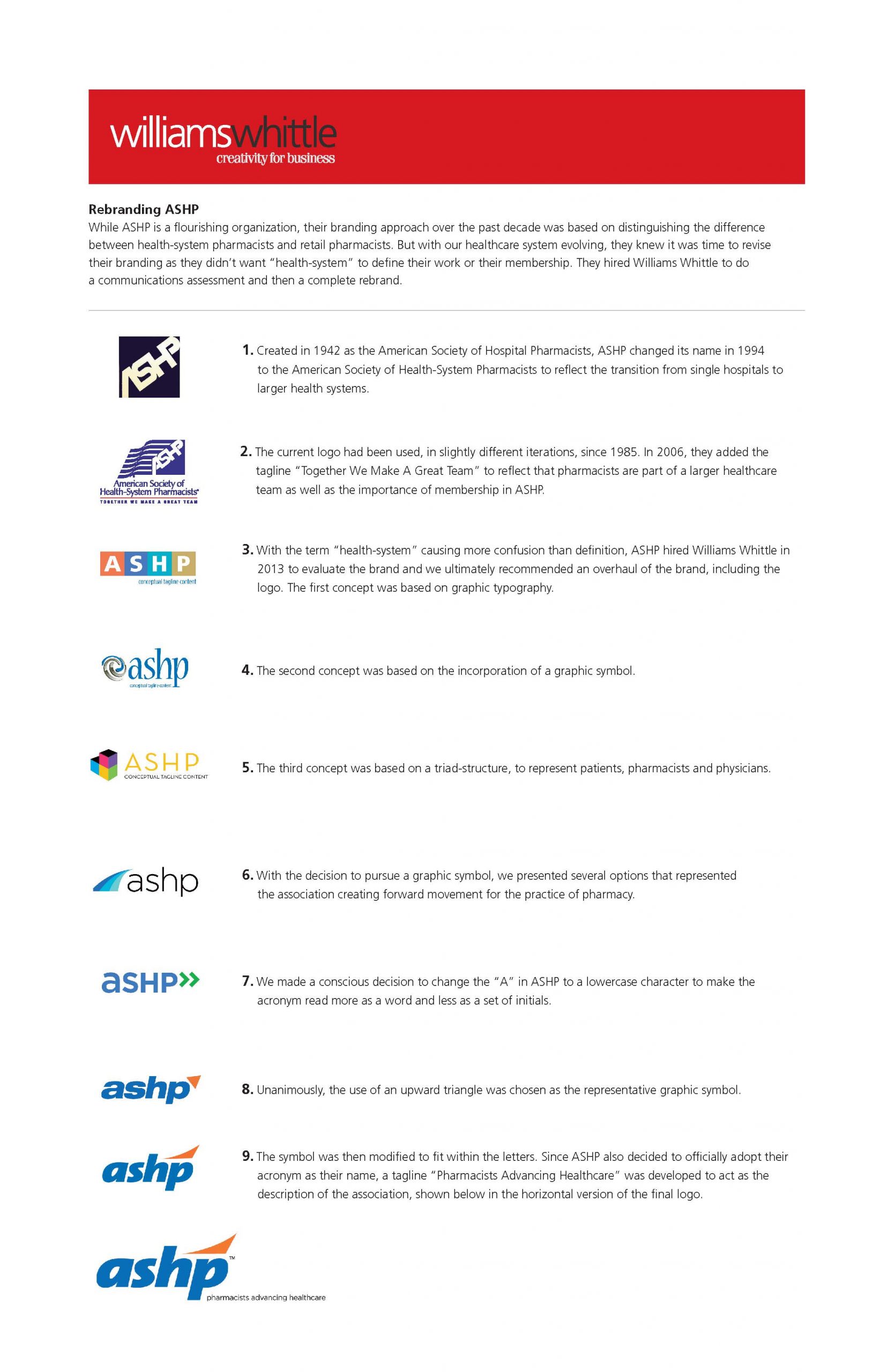
For the American Society of Health-System Pharmacists (ASHP), the goal of their rebrand was to de-emphasize “health-system” as it caused confusion between health-system pharmacists and retail pharmacists. They officially adopted their acronym as their name, we created a new tagline “Pharmacists Advancing Healthcare” along with a new modern font and iconography.
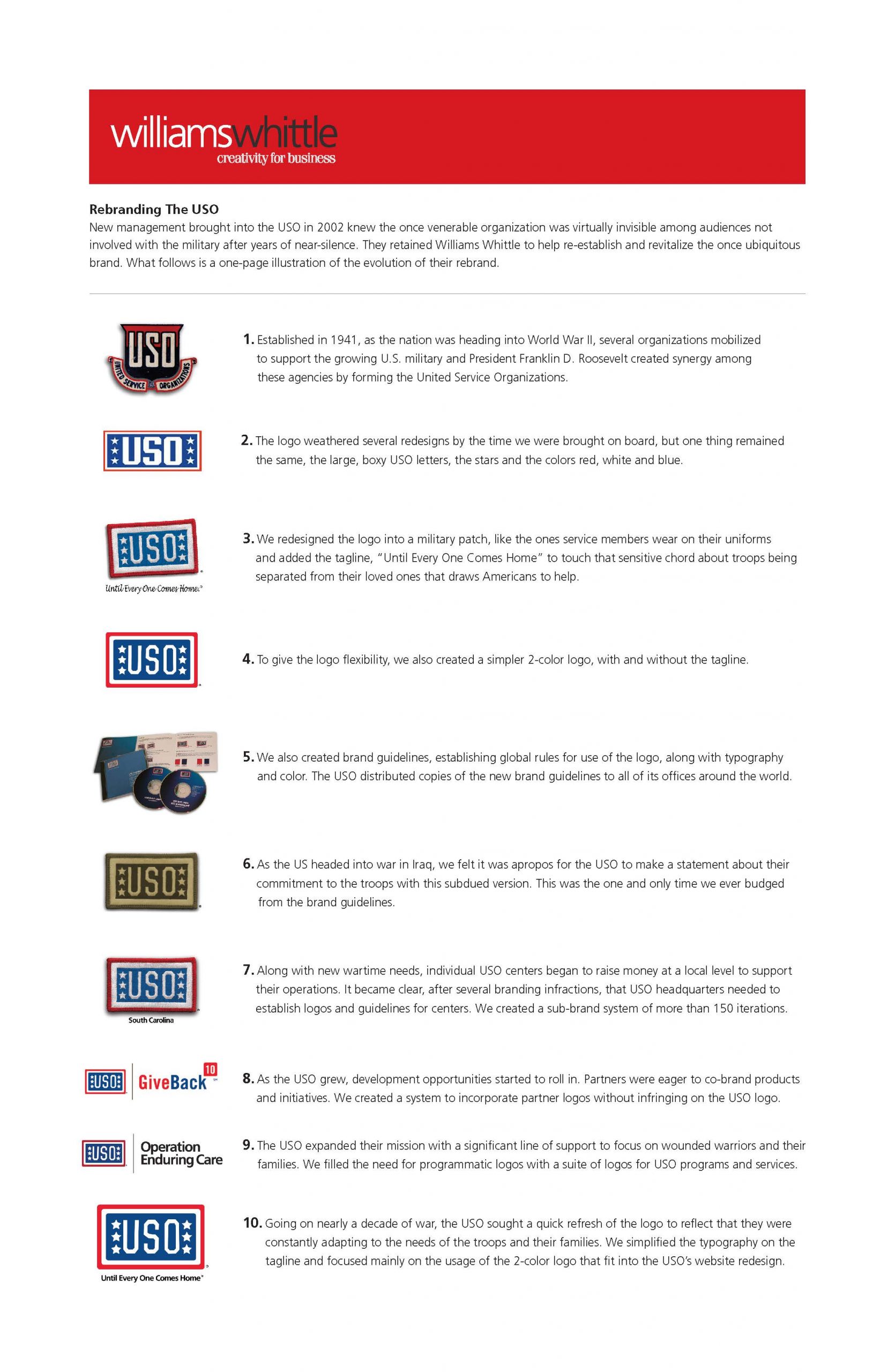
For the USO, the rebrand was focused on introducing the brand to audiences outside the military. While the basic color scheme remained the same, a tagline “Until Every One Comes Home” was added. Development opportunities required incorporating partner logos for co-branded products and initiatives.
And finally, here are examples of when a brand-new identity is required:
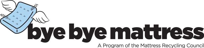
A couple of years ago, our agency was asked to create a name and logo for the mattress recycling program that would operate under MRC. If MRC was the B2B side of the organization, the new program was the consumer-facing side, so it needed its own consumer-facing identity.
After refreshing MRC, the agency created the Bye Bye Mattress (BBM) brand. We wanted the name to be easy, catchy, and memorable. Keeping to the ideals of a black, modern, san-serif style font as MRC, the logo-type is bold and really stands out among other brands vying for attention in this competitive field. The icon, a flying mattress with springs coming out, implies a used mattress (without being dirty) and gives the consumer the feeling that recycling your old mattress is easy. When you are ready to say “bye bye” to your old mattress, it “flies” away to the recycler. Simple and easy. The generally thick, cheerful, and cartoony style of the logotype and icon convey a sense of fun and ease — to counter any falsehoods that recycling is difficult and boring.
More recently, MRC has developed another sub-brand – the Sleep Products Sustainability Program (SP2). We were asked to develop a logo and badge for this program. The Sleep Products Sustainability Program is an environmental manufacturing program and the newest addition to the MRC family. It was important to give this program its own identity. However, we kept the general feeling of the MRC logo. The logotype is the “same but different” as the other programs: black, modern, and clean.
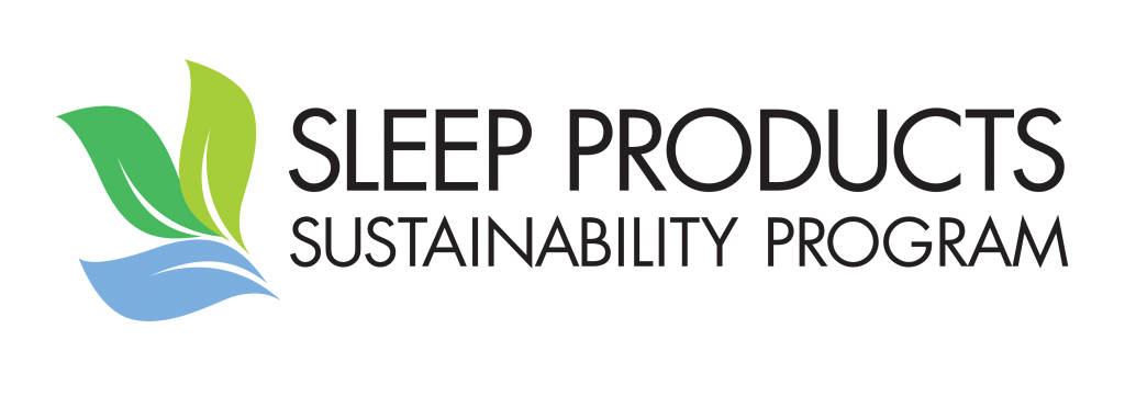
Since the program was created specifically for sleep manufacturers, it comes across as more serious than a consumer-facing brand. The icon plays off of MRC’s components icon, but utilizes a natural element (leaves) to represent the “green” goal of the manufacturing process that SP2 is promoting. The colors are pulled from MRC and BBM to visually complement the other logos and seamlessly join in as part of the ISPA family. A “seal” version of the logo was created as a promotional badge for companies to display. It was purposely designed as a circle, so it could be placed straight or at an angle for flexibility of design and also able to stand out regardless of the background it is placed on.
Whichever direction you choose to go, a refresh or a rebrand, it should not be taken lightly. Making a change in your brand identity requires full buy-in from the top to the bottom and a communications plan for launch.
We’d love to work with you on your next rebrand or refresh. Contact us to learn how we can help your brand stand out from the rest.