Don’t be fooled. Sometimes a refresh of your logo can be just as, if not more, tricky than creating a completely new one. While both present similar challenges—create a new visual identity that represents the brand, is fresh and endearing and one that everyone (internally) can agree upon and (externally) adopt—during a refresh you have to keep your eye on not straying too far from the original logo. There is a reason you don’t want to just scrap it and start all over!
That was the case when we started a refresh of the St. Charles, Maryland logo. A master-planned community located on your way to Southern Maryland and only 22 miles from Washington, DC, St. Charles offers more than just new homes and apartments. There are neighborhood pools, schools, tennis, golf, walking trails, a farmers market, shopping, and so much more; it offers a lifestyle. The brand itself has earned a place in the hearts of residents and among the real estate community. In fact, the brand is flourishing. It was the visual identity that hadn’t kept up.
There were other problems the logo was presenting. The color palette was unique, but the colors were too light to stand out on signage. And the delicate nature of the fingerprint, originally designed to reflect the “green” philosophy of the development plan, just didn’t stand out in anything but print and online advertising.
So, it was time for a refresh. The direction was clear: give the logo a facelift, so that it was still recognizable (maybe some people wouldn’t really notice) but refreshed.
We went back to our rules for a logo that we follow when working on branding projects like this. A logo must be:
- Simple
Easy to say, easy to remember. KISS (keep it simple stupid). - Flexible
Has to work across a variety of mediums and applications. - Extendable
Can be used for any sub-brands. - Emotive
Must evoke emotion. - Ownable
No competitors could use it as their own. - Appropriate
Who is the audience? Does it speak to them specifically?
One of the main reasons we embarked upon this project was because of #2, flexibility (as stated above). Let me present another client example to illustrate how important this rule is to your brand and logo.
The American Red Cross was a client when they went through a brand refresh a few years ago. We got to witness firsthand the tedious work it took to determine the calibrated direction they would take to update the logo. Why did they want to update this iconic logo? While The Red Cross name is well-known and widely regarded, to continue growing they knew they needed to develop a stronger emotional connection with donors. One way they addressed that in the logo design was by taking the Cross and placing it on a “pin”. The pin represents enthusiastic participation, like when someone wears a pin for all the world to see; it is a personal, grassroots and unique expression for the American Red Cross.
The logo moved from classic to modern classic. But, it also got a whole lot more flexible. With the new design, we could now display the logo on a dark or light background (it used to be only presentable on white only) and the pin could be separated from the name as long as they were still on the same plan (a sheet of paper or a presentation slide, for example.) Most people might not even notice the refreshed logo because the differences are subtle, but help the brand move to a difference place.
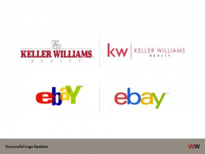
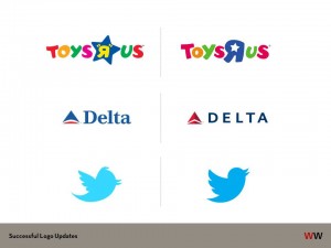
We also looked at other brands that made similar refreshes over the past couple of years. Some of the changes are subtle, but symbolic and forward-moving.
We used these examples to start a conversation about what direction we wanted the St. Charles log to move. Check out more details about Toys R Us and Delta here. Or about how geometry played a role in the new Twitter bird. The more dramatic change in the Keller Williams logo or the toning down of the eBay logo.
So, with an eye on keeping the St. Charles more flexible and more “2014” we went through several rounds of creating options for colors, tree trunks and foliage. And here is where we all landed, with blessings from all involved. And it debuted on the new St. Charles website just a few weeks ago.
What do you think? Tweet to us @williamswhittle


