It happens all the time. Nonprofits trod into our offices with their heads held high, but secretly holding back embarrassment. Despite having a brand that has made through the peaks and valleys of time, their brand has become diluted.
Sometimes, a program or service within a nonprofit (let’s call these “sub-brands”) can take on a life of their own. In some cases sub-brands become the brand in the eyes of consumers. And in others the sub-brand forms its own identity that isn’t connected to the corporate logo and circumvents the master brand. The outcome is that nonprofits don’t own their brand anymore, the sub-brands do.
Start from the beginning
When we approach a branding dilemma with a client, we first like to define what we’re actually talking about. Sometimes logos are confused with brands. This blog post from “Just Creative” does a good job at laying it all out.
A brand: The perceived emotional corporate image as a whole.
A logo: A logo identifies a business in its simplest form via the use of a mark or icon.
An example
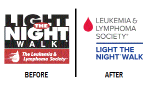
A recent example of a how a nonprofit took steps to own its brand again is the Leukemia & Lymphoma Society, who just launched a new brand campaign. They knew they needed to lasso their brand because “people had been giving to specific LLS campaigns, but [they] were just not attributing that to the Leukemia and Lymphoma Society.”
This is where LLS smartly started the process—they decided to start with a brand audit which paved the way forward for a rebrand. And then they redesigned the look of their campaigns with LLS having dominant presence in their initiatives, like Light the Night Walk and Team in Training.
A brand we’ve helped
We were hired by ASHP (American Society of Health-System Pharmacists) in 2013 to provide an analysis of their current branding efforts. Part of the audit was gathering examples of ASHP’s current materials to assess their effectiveness: print, web, email, etc. After our assessment, we provided analysis on three cornerstone communications: tagline, language/messaging and visual identity – logos and design.
There were several conclusions, mostly unsurprising to ASHP, but it helped them make a swift and definitive decision on a way forward—their current tagline was confusing, they did not have a core narrative and their visual identity had no consistent quality. Even further, some of their own products and services had their own distinct identity that essentially hijacked the brand.
Corralling lost sheep
Several months after the audit was complete (which included a 50-page communications report), we began the process of rebranding ASHP, starting with the logo and tagline. And as soon as we had a newly approved visual identity we tackled the big job of revamping their sub-brand system; or corralling the lost sheep, as I like to put it, because some were really, really lost and quite happy doing their own thing away from the flock.
The process started with meetings with each department that owned sub-brands and in-depth discussions on how the logos/brands were used and what they’d like/need in the future. After nearly a month of meetings, we began the process of boiling down our recommendations for the new sub-brand system which included eliminating the need for quite a few sub-brands.
A sub-brand had to fit one or more of the following criteria to make the final cut before we started designing the new sub-brand system.
- It needed to be clear identified because it was a product/service that was sold to a member or an outside party
- It already had enough brand recognition that by rolling it up into the master brand we would cause more confusion
- It needed its own separate identity to differentiate it from other similar products, such as a series of events or training seminars
The sub-brands that didn’t receive a new, updated logo were treated as a title on a webpage, flier or other material. And it worked. Because in a lot of those cases, they were originally given logos “just because everyone else had one.”
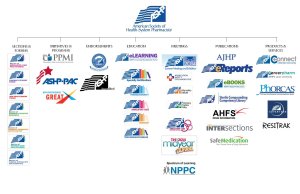
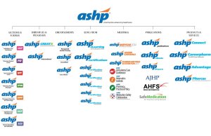
Here’s a before and after of the sub-brand system. Click on the images below to see them in larger scale.
Old visual identity system
New visual identity system
The result is a new system that allows ASHP to own their work, whatever it might be, and have consistent representation in nearly all of the logos. No more lost sheep here!


