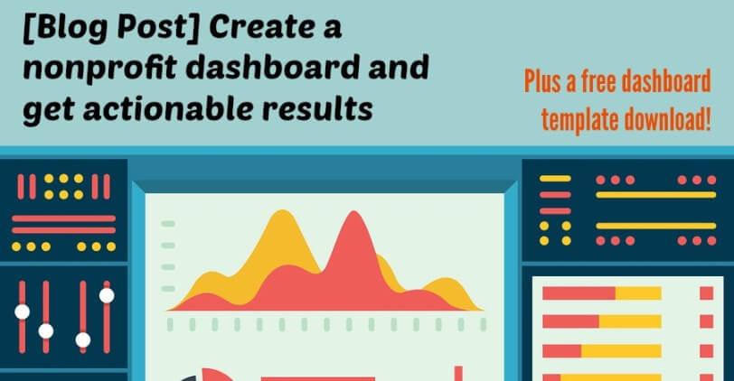
It’s been a while since I’ve blogged about one of my favorite topics—dashboards. But this time, I’m offering a free dashboard template download. (Be patient, and keep reading. Link at the end!) Dashboards are a powerful tool for nonprofit marketers—they are a way to compile a lot of data into easy reading. And that is where the problem often lies; it’s sometimes easier to crunch data than to find a way to turn it into a visually-appealing report that leads to actionable results. Let me break down what that really means.
Every workday around lunchtime, I check out my health app on my iPhone. Some days, when I have glued myself to my keyboard, I will only have walked about 500 or fewer steps. So, I think to myself “what and when can I step away and get moving?” That is an indicator with actionable results! If I looked at my app and said “OK. Nice.” and put it away I would never reach my 10,000 step goal. That is the type of action you want when your team assesses the dashboard. You want to the outcome to be questions like “Why was this so high?” or “Why was this so low?” and “What can we do differently?” or “What was the secret ingredient to such a large increase year-over-year?” with the answers helping you plan effectively, efficiently and accelerate your results in the future. Your dashboard becomes a tool that leads you to actionable results.
 A typical for-profit dashboard is used to gauge operational and financial data. So, when you’re converting this for use for a nonprofit AND with marketing activities, it’s important to mix both the concrete results of marketing campaigns with indicators that show how successful you are in achieving your organization’s mission. In marketing, you’re not on the front lines delivering services and maybe you’re not on the front lines negotiating partnerships, but the work you do is getting new people involved, getting people more passionate about your work—things that drive engagement with your organization and ultimately your mission.
So, what does your dashboard look like? Say you ran a #GivingTuesday campaign. You’ll want to have basic measures of success, like: money raised, total number of donors vs. new donors, website traffic, use of your hashtag/mentions, media coverage and value. But, you’ll also want engagement stats, or the human-side: increase in engagement (post likes, post shares, page likes, favorites, retweets, etc.) on social media or your share of voice (if you use a program that can calculate this), time on your website and number of pages visited, partner involvement (and whatever your arrangement entailed), open and click-through-rates on your emails. These are just some top-line ideas.
So, I promised a free dashboard template download. [email-download download_id=”3280″ contact_form_id=”1929″] While anyone can build a dashboard in Excel, we’re equipping you with a visually-appealing template to start you off in the right direction (let’s be honest, not everyone can design). As you start to edit this template, here are a few pointers:
- The printable area is set to print on standard letter paper. All of the data input is below, in the nonprintable area. Make sure you don’t adjust the columns or the dashboard itself will get contorted.
- Change the color scheme to match your nonprofit’s brand guide. If you don’t have one, use this site to put in your main colors and it will generate an attractive color palette for you.
- The font used is Arial. If you’d like to change it, remember you’ll have to select and change all of the headers, numbers on the axis and chart labels, too.
- You don’t have to stick with the same charts every month or in the same format. Sometimes data that is more compelling pops out somewhere else. Double-click the chart and “change chart type”!