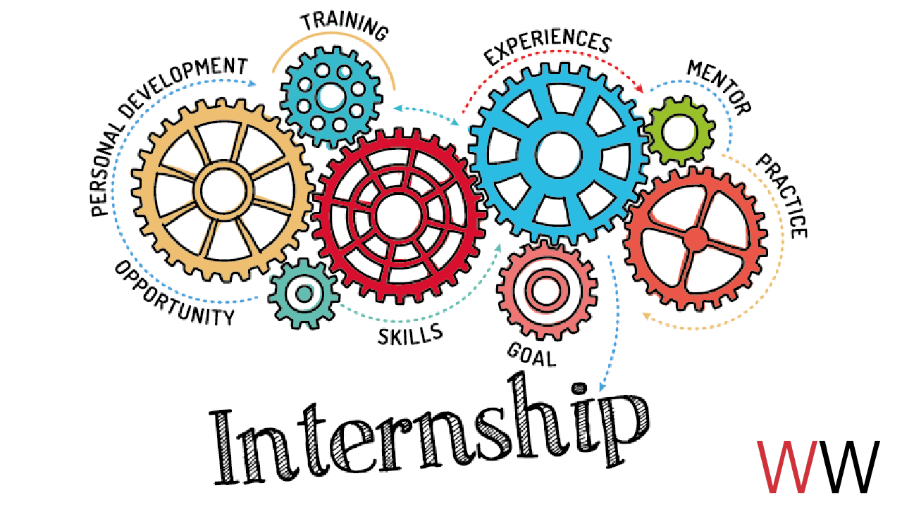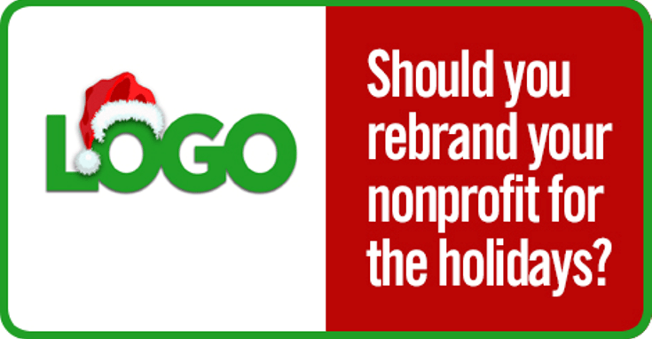
It seems that when the holiday season rolls around in mid-October, branding rules sometimes get thrown out the window. It may be that your development team or your CEO is just itching to give your logo a mini holiday transformation or you feel that infusing some holiday spirit into your logo will give your year-end appeals that extra oomph. But, should you really go down that route? What are the guidelines for holiday branding and what would a mini-rebrand really do for your nonprofit giving season?
There are several reasons why I’m raising the red flag on rebranding your nonprofit for the holidays.
IT’S NOT WORTH IT REASON 1: YOUR BRAND SHOULD NEVER UNINTENTIONALLY CHANGE
Your logo identifies your nonprofit (or business) in its simplest form via the use of a mark or icon. Behind that visual cue is your brand—the emotional image that your stakeholders identify with. If you want to continue to build on your emotional image (trust, quality, compassion, etc) changing your logo for the holidays is not going to accomplish that. It will only add religious or non-religious connotations to your brand which are confusing and assumptions that are often unfounded.
Example: There’s been a lot of debate between static logos and dynamic logos lately. I’m personally not sold on dynamic logos in general, but I can say that Google doodles are the best example of a logo that changes appearance, but still maintains a strong brand ethos. Check out the holiday Google doodles. While they are all very “christmasy,” they only represent 3 days out of 365. Other ideas and cultures are also represented in Google doodles.

IT’S NOT WORTH IT REASON 2: NOT ONE IMAGE DEFINES THE “HOLIDAY” SEASON
The holiday season includes much more than religious celebrations like Christmas and Hanukkah. America in the 21st century is a true melting pot and being aware and respectful of different cultures and observances is more important than ever. You’ll want to avoid cultural stereotypes (like Christmas trees) and make sure that any other “holiday” graphics you’d like to include in your logo aren’t offensive to certain groups of people. In the end, there isn’t just one image that defines the holiday season.
Example: While Starbucks simple red holiday cups certainly caused an uproar, I thought it was the right move for the brand. In the past, Starbucks’ holiday cups were designed with snowflakes, Christmas trees and reindeer. This year, the plain red color was simple enough for every person to interpret the holidays as they like—that may be much more meaningful to people of all beliefs than poinsettias and musical notes. Lesson learned: sometimes all you need is to change your color palette, not your logo.
 Image from Starbucks News
IT’S NOT WORTH IT REASON 3: YOU CAN’T AFFORD IT—MONEY, TIME & EFFORT
Typically holiday advertising works for the retail world: “Hey! It’s Black Friday and we’ve got a sale going on!” But, the work of a nonprofit doesn’t work like that. The value to those you serve or your program costs don’t rise and fall based on promotional periods. For most nonprofits with conservative marketing budgets, you don’t have money or time to waste on confusing and then re-explaining who you are and why people should support you.
While this holiday season may be over, it’s never too early to start thinking about next year’s holiday marketing and giving campaigns.