Big data has been a hot topic for years and affects organizations across every industry. But most organizations, especially in the non-profit world, don’t have the resources for data analysis in-house or the budget for fancy data tools.
The truth is that most organizations don’t need a major financial investment in data tools. You can adopt technology and big data strategies to make data-driven decisions using Microsoft Excel paired with intuitive data analysis.
Williams Whittle (WW) uses data visualization as a strategic planning tool for all our clients. From identifying trends and spikes to monitoring goals and results, to aggregating diverse data sets, data visualization is an essential tool for every marketer.
How Do You Get Started?
The first thing you need to do is to define the problem you are trying to solve. Once you know what question you need answered, you need to collect all the Key Performance Indicator (KPI) data associated with it.
There are many different data sets that organizations can track. Here are several examples of data sets that we track for our clients:
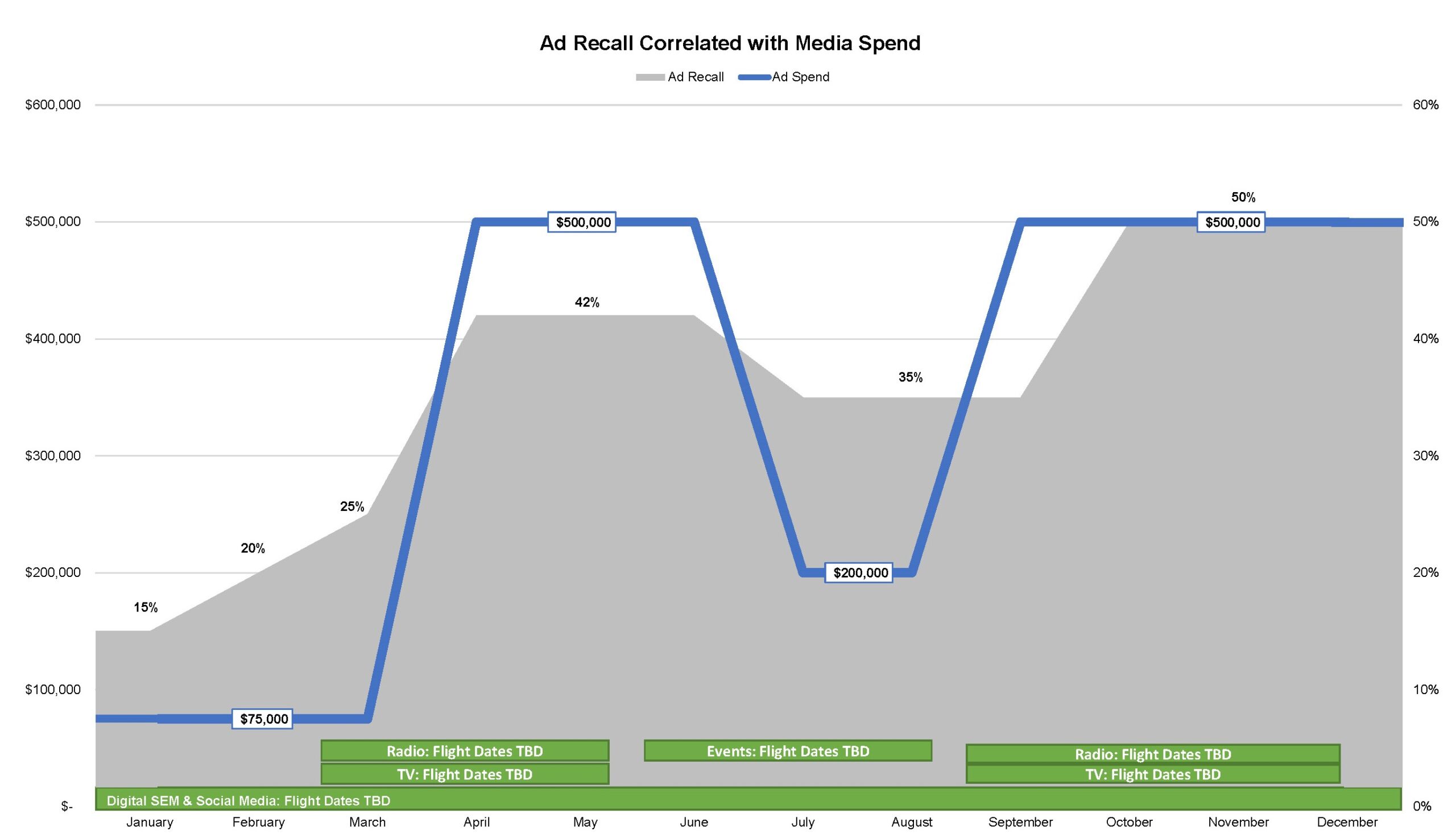
Ad Recall Correlated with Media Spend
WW conducts an advertising recall survey for our nonprofit clients through primary research at least twice a year — once before advertising runs, and once after it runs (pre-advertising vs. post-advertising). We also test unaided and aided recall of our client’s brand and their key competitors, likelihood to choose, and awareness of specific key messages.
Likelihood to choose is an extremely important metric. The higher the ad recall, the more likely people are to choose a brand. Ad recall is driven by a mix of all types of media to reach all kinds of respondents in your demo as people have different media behaviors. It is our experience that broadcast (TV and radio) drives the biggest spikes in ad recall, and sometimes print. Online is slowly starting to reach higher ad recall levels. Peaks in recall tend to follow broadcast media flights and valleys when little or no media is in market. Our data insights usually show a correlation between ad recall and ad spend (the more you spend, the higher the ad recall).
 Download your free data visualization templates here.
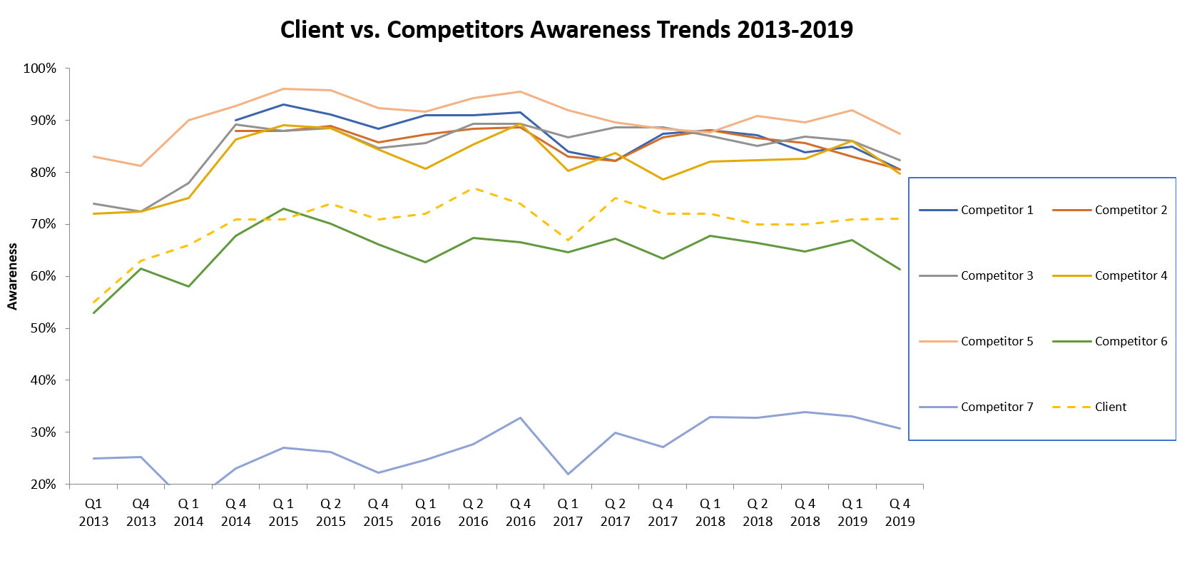
Competitor Awareness Trends
There are outside factors to take into account when you review the data sets. In addition to HOW you are spending your ad dollars and WHEN (during what time period), you also need to look at your competitive set. If your competitive set is advertising at the same time as you, or you are advertising during a political year (2020 election here we come), you may find that the added “noise” in the marketplace may have impacted your recall in spite of a high spend.
Competitive spending data for many organizations can be purchased through a 3rd party source such as Kantar Media. If you don’t have the budget to track competitive spending, this data can usually be found in an annual report under a category such as Advertising and Consumer Education, Fundraising, or in Overhead which makes it harder to discern. There are other 3rd party sources for additional financial information on nonprofits including GuideStar.org, CharityWatch.org, CharityNavigator.org, Givewell.org, and BBB Wise Giving Alliance Give.org.
 Download your free data visualization templates here.
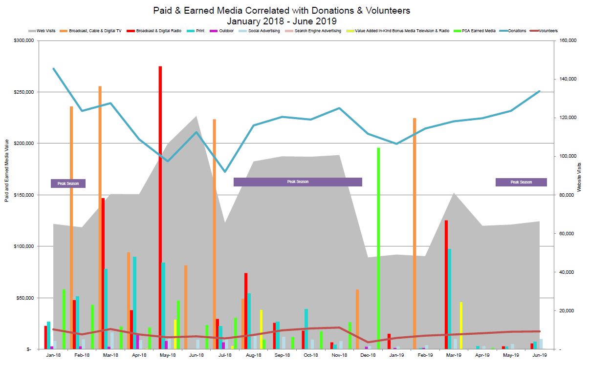
All Media Correlated with Donations
The next type of chart is a drill-down of all media. This includes paid and earned media correlated with web and/or landing page visits, and donations (or another end-use metric) by month. This sample chart can include data on website visits, broadcast, cable, digital and terrestrial radio, OTT, print and outdoor spend, community outreach events, brochures distributed, tools downloaded, PSA and other earned media values, as well as value-added in-kind bonus for TV and radio, Facebook and Instagram impressions and likes, Google Adwords/paid search impressions and clicks, as well as the same data for Google Ad Grants.
This is another chart that usually has a direct correlation with it if you have a strong call to action that drives traffic to your website. But what if you have multiple campaigns in market with different call to actions? Then your data will not tell a singular story. It is important to overlay seasonality of your product/service with this chart.
For our mattress recycling client, we track the number of units recycled by month by state. We look at how this data is impacted by peak moving season and peak mattress sales season (when you buy a new mattress, you usually discard the old one) compared to the paid and earned media by month for that state. The number of customer service phone calls, emails and social media questions by month can also be overlayed onto this data chart to aid in capturing the seasonality of your product/service.
The months of the year are noted at the bottom, and the axis on either side varies based on what you are trying to correlate.
 Download your free data visualization templates here.
In terms of presentation of the data, we have revisited an “old school” method using charts printed on transparency paper that overlay with each other so that different sets of data can be analyzed at the same time to identify any patterns or correlations. For example, website traffic over a period of time was charted on one table, while advertising spending against the same period of time on another. This solution also allows infinite combinations to look at the data as a whole or to isolate specific pieces of data.
You don’t need to spend $60,000 plus a year on fancy data visualization tools such as Tableau or Zoho. An advanced knowledge of Microsoft Excel combined with a curious, explorative, and analytical mindset can create data visualizations that inform your clients of valuable trends and data correlations that will turn you into a data scientist.
For more information, check out the rest of the articles in our data series on website analytics, social media, and PSA dashboards or contact us to get started on your own data visualization reports.